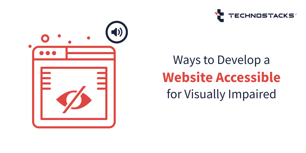
Ways to Develop a Website Accessible for Visually Impaired

Technostacks
Web accessibility facilitates people with disabilities to distinguish, comprehend, navigate, engage with, and back the web content. As per global governance, user experience (UX) designers must make sure equal accessibility for all the user base by designing web experiences that can be leveraged, comprehended, and accessed by people with a varied range of visual abilities.
User base with visual impairments should not have to adjust their behavior to efficiently achieve their goals. Instead, effective web designers and developers should take care of the requirements of all users, comprising people with visual impairments.
Let us explore what are the precise ways you can develop your website more accessible.
How to Make a Website Accessible for the Blind?
It is not rare to see websites that utilize blends of background and foreground colours that make pages virtually uncomprehensible for colour blind users. Contempt all this, people with visual impairments leverage the web every day to surf, read and create emails, and to do anything else anyone can possibly do on the internet.
Here are the ways to make websites accessible for blind users and visually impaired user base.
1. Provide necessary contrast by leveraging colors and textures
When we discuss about the set benchmarks, the web content accessibility guidelines (WCAG) comprises the needs for colour contrast. As per the WCAG 2.0 Level AA guidelines, the contrast ratio for normal text should be no less than 4.5:1 and for bigger text it should be at least 3:1.
The purpose WCAG states these ratios is to make sure that all visual content is effortlessly traceable to as extensive a series of people as possible. An efficient use of colour contrast, aiming to comply with the benchmarks, not only enhances the aesthetic appeal but even magnifies the usability facet of the content.
Furthermore, take care of graphs and adding textures or patterns to enable website accessibility for blind users. These offer an additional layer of differentiation amid data points when the series of value, hue, and capacity initiate to break down for user base.
2. Bound and prioritize color in the design interface
The more colors you acquaint with to a design interface, the more tough it will likely be for even a non-vision-impaired user to speedily recognize simple actions and hyper-links. For a person with color blindness, this only turns more problematic as more colors are used.
Advanced software solutions provide support for color blind people. With modern technology you can make sure that graphical insights are conveyed precisely to people with diverse categories of color vision impairment, comprising people with color blindness. In addition, modern-day tools help in crafting color palettes for websites and applications.
3. Offer enhanced keyboard accessibility
Keyboard shortcuts can make steering websites for visually impaired users effortless. A mouse is not effective for navigating as it needs hand-eye coordination. This is particularly true for users who are blind and leverage screen readers to explore the web.
For people with lower vision, keyboard directions make it likely to navigate a website portal without having to tirelessly emphasis and trail a mouse cursor on a screen.
Related Article:- The Importance of Accessibility in Web Design for Blind
4. Do not count on merely colors to communicate significant information
When it comes to notifications, alerts and actionable page components like textual links and buttons, make clear that these are expressive to the user by uniting more than a straightforward color alteration.
Almost unanimously, people comprehend that underlined blue text is a hyper link. On the other side, there are still websites that underline the blue text and do not hyper link it to anything. Colour-blind user base should be able to rely that when the color dealing is taken away, the underline will let them know that it is really a hyper link.
Likewise, user base will gain from the usage of icons and applicable labels associated alerts and actionable page foundations. Every page component should have more than one visual cue. Pictures, Hyper-links, Call to Action buttons, and other similar components can be improved with a precise icon, shape, positioning, or text content.
Much like the underlining of hyper-links, user base will identify prime action signals, like icon sizes, right placements, and boldness effects.

5) Consider the spectrum of visibility
While it is imperative to take screen readers into account, it is a myth that everyone who is blind leverages one. Only 15 percent of people with eye ailments are completely blind, and this is something you should consider when taking website design and development decisions.
Many professionals may think that stuff like font size do not matter as blind people only utilize a screen reader, which really is not true. There are people who are not blind but find difficulty or cannot totally read 11 point font.
So, it is significant to consider the complete spectrum of visibility, before designing websites or web-based applications.
6) Use modern-day accessibility testing tools
Not everyone can manage to pay for to hire an accessibility expert, and consult web content accessibility guidelines. However, it is easier today to test websites for web accessibility using modern-day tools.
The WAVE tool is effective for people who are not accessibility authorities. It recognizes what WCAG is asking for, and when you operate the tool, it guides you on what does not meet accessibility guidelines. It spots stuff such as broken ARIA references, contrast, and structural challenges.
Another valuable tool is Color Oracle, a free color blindness simulant. One can even test out if his site works well with a real screen reader like NVDA.
7) Allow manual font size alterations
Today, there are several ways to enhance accessibility for the visually impaired, comprising use of magnifying software solutions and offering the capability to adjust or easily alter text size in browser-based settings.
Nevertheless, many people with lower vision, particularly older age people who may be going through vision loss issues, will not be comfortable to utilize a software or easily understand browser’s text size alteration choices.
By offering users a clear selection, whether it is a slider, a drop-down, or a simple button to adjust the font size, companies with their flexible website features turn more friendlier to visually impaired user base.
Related Article:- How to Improve Accessibility on Your WordPress Website?
8) Apply descriptive labels for buttons and links
Evade leveraging vague link labels like “click here.” People who utilize tools like screen-readers often leverage a keyboard shortcut to easily list out all the hyper-links on a web page to make readability easier.
Subsequently this list of links has no adjacent text and makes a contextless state. So, it is effective to craft descriptive labels for buttons and links that make better sense. This is a useful practice that helps all category of user base.
Descriptive link and button labels can also help sighted users, and assists in enhancing search engine optimization (SEO) for the website portals.
9) Use headings to well-organize website page content
Headers in websites benefits all types of users. There are several approaches where screen readers that back user base to scan pages get an inclusive imprint of a web page’s content.
One of the approaches to better skim a web page with a screen reader is to quickly hurdle from one heading to the next ones. While using a screen reader, users can hear a generic overview of the web page’s concise information and they can then backtrack to explore the earlier parts they are most concerned in.
Regrettably, many sites do not include proper headings on web pages. Without headings, this approach of skimming through content is not possible. Keeping this in mind, it is a critical that designers and developers well-organize content with precise heading formatting and styles.
10) Offer alt text for non-text content
When users use a screen-reader it reads a picture or graphic saying “graphic” or “picture” and then read the picture’s alternative (“alt”) text. If a picture or an image doesn’t have alt text, the screen-reader will hop it, so for this motive, it is required to add alt text for images and pictures.
You must even add descriptions for video and audio components on web which must be to the point. Recall, screen readers go line-by-line, so convey your point by using your text and alt text in as limited words as likely.
11) Leverage descriptive titles for all web pages
Website portals should always comprise titles that define the topic or objective of a web page. The purpose behind that is screen readers read and announce the page title while the loading a website page.
Users who are visually impaired and require to utilize a screen reader benefits from this functionality, as otherwise they would have to invest extra time and effort in scanning a web page to identify what sort of content the web page possesses.

Digital Accessibility Phases and Endorsements
Digitally enhancing accessibility starts with colour contrast. The journey to craft an accessible interface might seem discouraging, but with vigilant planning and implementing best practices, this objective can turn handy.
Comprehending the significance of colour contrast
To initiate with, companies must understand the significance of right colour contrast. Colour contrast meaningfully effects readability factors, usability aspects, and a business perception if it is ignored.
An inadequate contrast ratio might even avert some of the users from retrieving information and insights altogether. Hence, comprehending colour contrast is the foremost phase in crafting accessible online content.
Performing proper website accessibility audits
Performing website accessibility audits assists in identifying and spotting aspects of concern. These audits can be performed with automated accessibility checkers or manual methodologies that encompass users with numerous impairment levels.
This process can spot challenges and areas of issues where colour contrast is inadequate, guiding where progresses are essential.
Executing alterations as per audit outcomes
Once the audit is performed, companies can execute alterations, with a focus on extents of lower colour contrast ratios. This can comprise altering website designs, font colours, text sizes or background setting to improve contrast and improve readability.
Training and educating your web professionals
Lastly, training teams to comprehend the significance of digital accessibility is obligatory for change execution. Whether it is the design, developer, testing or QA team, everyone should be educated and further trained to meet benchmarks for website accessibility for the visually impaired.
This understanding makes sure that visual accessibility stays a priority while crafting fresh web components and enabling ways to improve web accessibility.
The path to ensuring digital accessibility might be thought-provoking, but the outcomes surely justify the applied effort. By blending higher contrast colour schemes, companies can ensure that their online content is better usable and understandable to everyone, thereby enhancing approachability for all.
Key Takeaways
We explored ways to make website accessible for visually impaired. However, there still stays stuff to be done to turn web-based experiences more reachable for people with blindness or visual disabilities.
Consider blending the suggested tips into your design workflow. Take these suggestions to a design team to enable conversations about the significance of designing websites that are easily accessible for all user bases across an extensive range of abilities.
Use web-based accessibility valuation tools to assess your site’s content and ensure precise compliance levels. Introduce accessibility precedence in the design-based communities and groups, and you will enable new opportunities for an entirely fresh audience of web-based user base and a precise series of openings for modernization within the UI/UX domains.
FAQs
How do you make your website accessible to blind users?
Color contrast is necessary to ensure blind accessibility on your site. Your website requires you to meet WCAG. 20 A.A. needs, and you must utilize high contrast amid font and background colors. If not, it is the right time to work on your website color contrasts again.
What are the steps to develop a website accessible for the visually impaired?
The steps to designing a site accessible for visually impaired users include comprehending color contrast, performing accessibility audits, executing alterations based on the audit report, and finally, assigning trained web design professionals to work on your website to make it friendly for such users.
What methods do you use to make websites accessible to people with disabilities?
The methods to make websites accessible for disabled people include comprehending the related guidelines, using advanced software tools, improving color contrast, using descriptive headings, using Alt Text for graphics, having captions and transcripts for multimedia, having better keyboard accessibility, utilizing RIA roles, and create accessible forms.
What is an example of a website for the visually impaired?
The websites of renowned companies like The BBC, Microsoft, and The National Federation of the Blind are a few examples of websites for the visually impaired. These sites have an assortment of accessibility functionalities comprising keyboard shortcuts, high-contrast color arrangements, and effortless navigation.
How would you improve the accessibility of your website?
Some approaches for improving your site’s accessibility include adding precise alt text to images, enhancing headings, crafting accessible PDFs, knowing when to use which fonts, utilizing ARIA landmarks, adding labels, and explicitly marking up tables when needed.
How to develop a website that accessible for visually impaired?
One can develop a site that is accessible for the visually impaired by enabling color contrast and textures, properly facilitating background images, adjusting font sizes, prioritizing significant information, and offering more clarity with the use of precise icons.
How would you build a website for blind people?
To make your website design better for blind people, separate content, and structure, offer text alternatives, avoid using color to present data and information, leverage textures instead of color, apply monochromatic color styles, and use contrasting colors for enhanced readability.
